Take Me Back To The Top
" height="84px" id="MAQxlhQbJ" width="1263px"/></svg>)
" width="1026.5px"/></svg>)
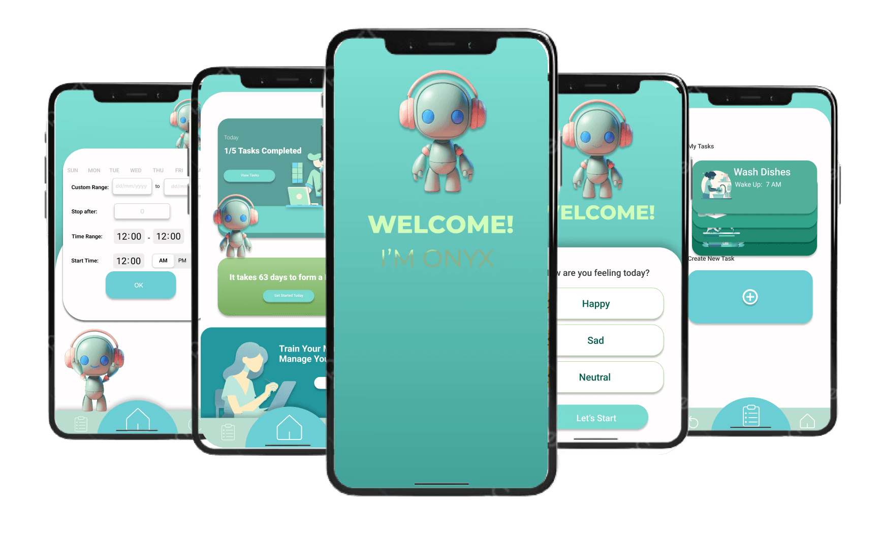
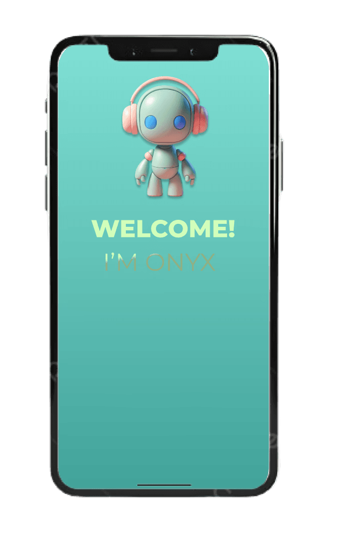
Onyx
Onyx is a mobile app designed to help people with ADHD manage complex tasks by breaking them down into smaller more managable steps
My Role
End-to-End UI/
UX designer
Team
Gargi Sharma
Jessica Myers
Me
Industry
Productivity
Duration
2 months
Tools
Figma, FigJam,
Zoom
The Process
Background
& Research
Proto-Persona
User Interviews
Affinity Mapping
Competitive
Analysis
Goblin
Forest app
Headspace
Ideation
& Planning
Feature Prioritization
Journey map
Story board
User flow
Wireframing & Testing
Paper Prototype
Low-fi wireframes
Usability testing
Prototyping
Mid-fi wireframes
Usability testing #2
Style tile
Hi-Fi Prototype iteration
The Goal
Breaking down complex tasks into smaller steps can help freelancers with ADHD
manage their workload, reduce anxiety, and increase motivation through
celebrating their small wins while feeling rewarded.
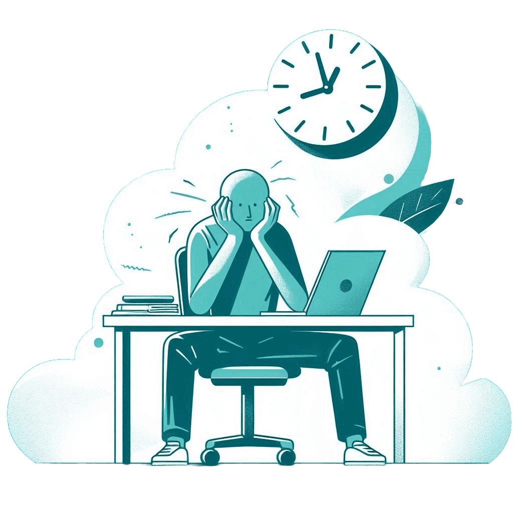
Problem Statement
ADHD can hinder task management due to challenges with focus, motivation,
and organization, resulting in anxiety, procrastination,and reduced productivity.
Background & Research
Proto-Persona
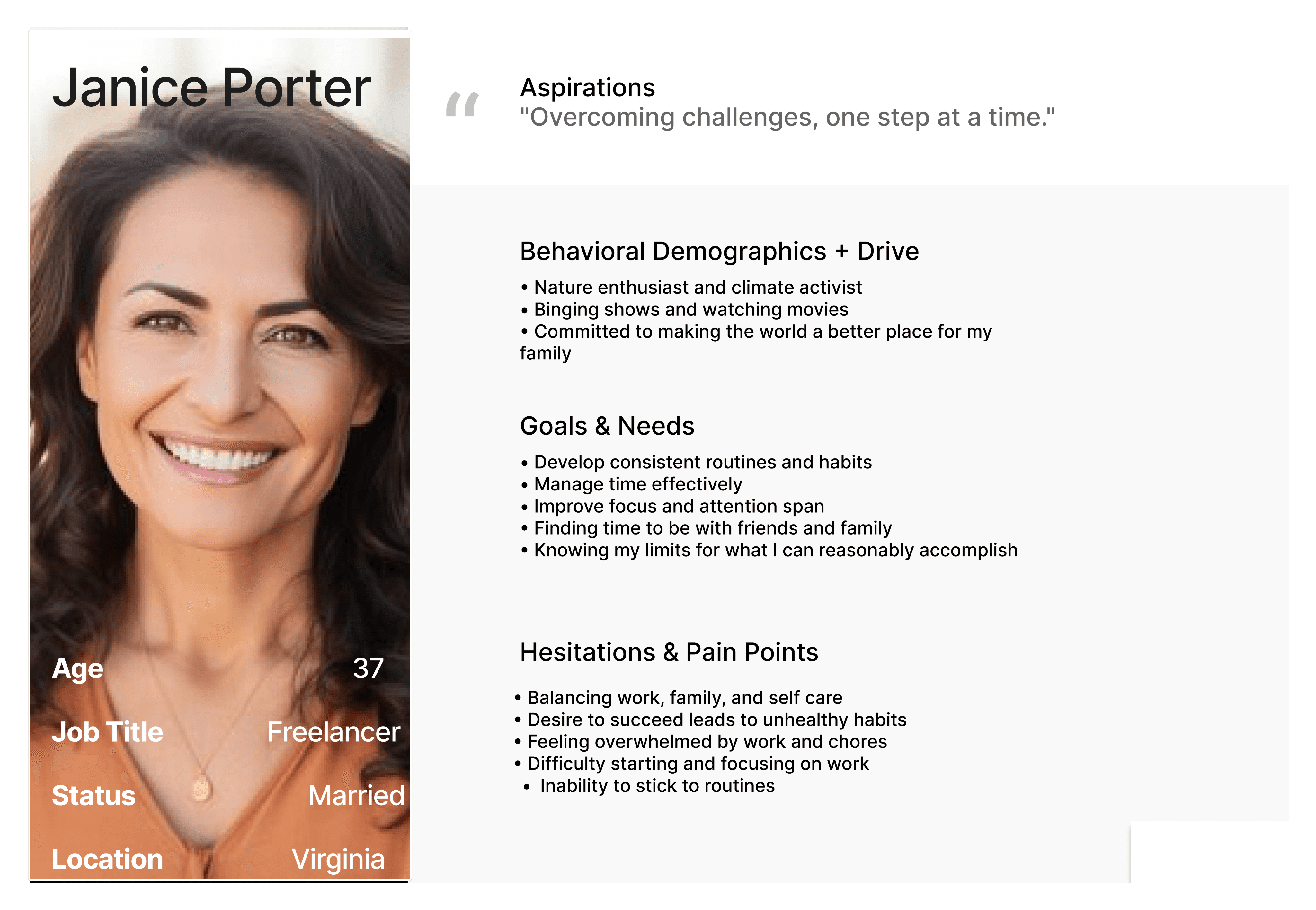
We started by creating our proto-persona…

We wanted to highlight and define a persona that could benefit from our app. Janice is a freelance graphic designer who
often feels overwhelmed by her daily tasks despite her many goals. She has tried ADHD manager apps before but nothing
seems to have worked for her.
User Interviews
Using our persona we conducted 5 user user interviews…
“I am easily distracted and often times it is very hard to start a task. I get anxious and things bubble up in my head. ”
“Organizing my tasks into a to-do list of all my priorities helps to alleviate my anxiety and helps me decide what to do first because otherwise I get overwhelmed and end up getting nothing done.”

“I tend to organize my tasks by the level of panic I associate with said task. The ones I am most stressed out about I will do first.”
Affinity Map
From the feedback we gathered from our interviewees we created an Affinity Map…

We gained valuable information from our user's insights as we categorized ideas into needs, pain points, distractions,
task prioritization, and management
Analysis
Competitive Analysis
gauging what is already on the market…
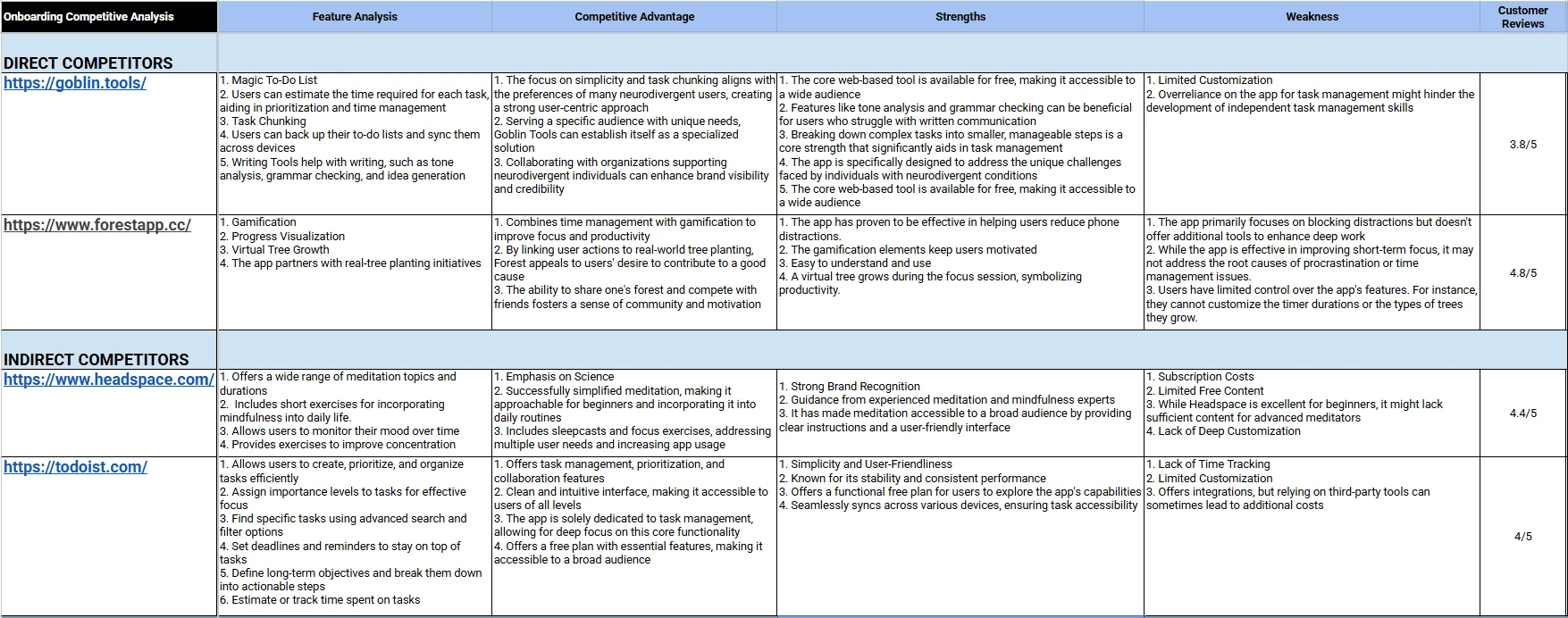
We analyzed a few of our application's direct and Indirect competitors and some notable strengths are that the platforms
are mainly free to use for users and effectively reduce phone distractions. There are gamification elements that reward
users for the completion of their tasks which has been effective in improving motivation. Some weaknesses of our
competitors is the limited customizations for users, subscription costs, and only focuses on blocking distractions.
User Persona
Using all of our background and user research we were able to flesh out user personas for our app…

Individuals who have ADHD need help managing complex tasks and ADHD is not confined to age so
we decided to include personas that range in different age groups who are at different points in their
busy lives. We decided to focus on highlighting their pain points managing their ADHD while including
their respective life goals.
Ideation & Planning
Feature Prioritization
I facilitated ideation sprints where we did and I Like, I Wish, What if? diagram and did dot voting after completing
a feature prioritization diagram…
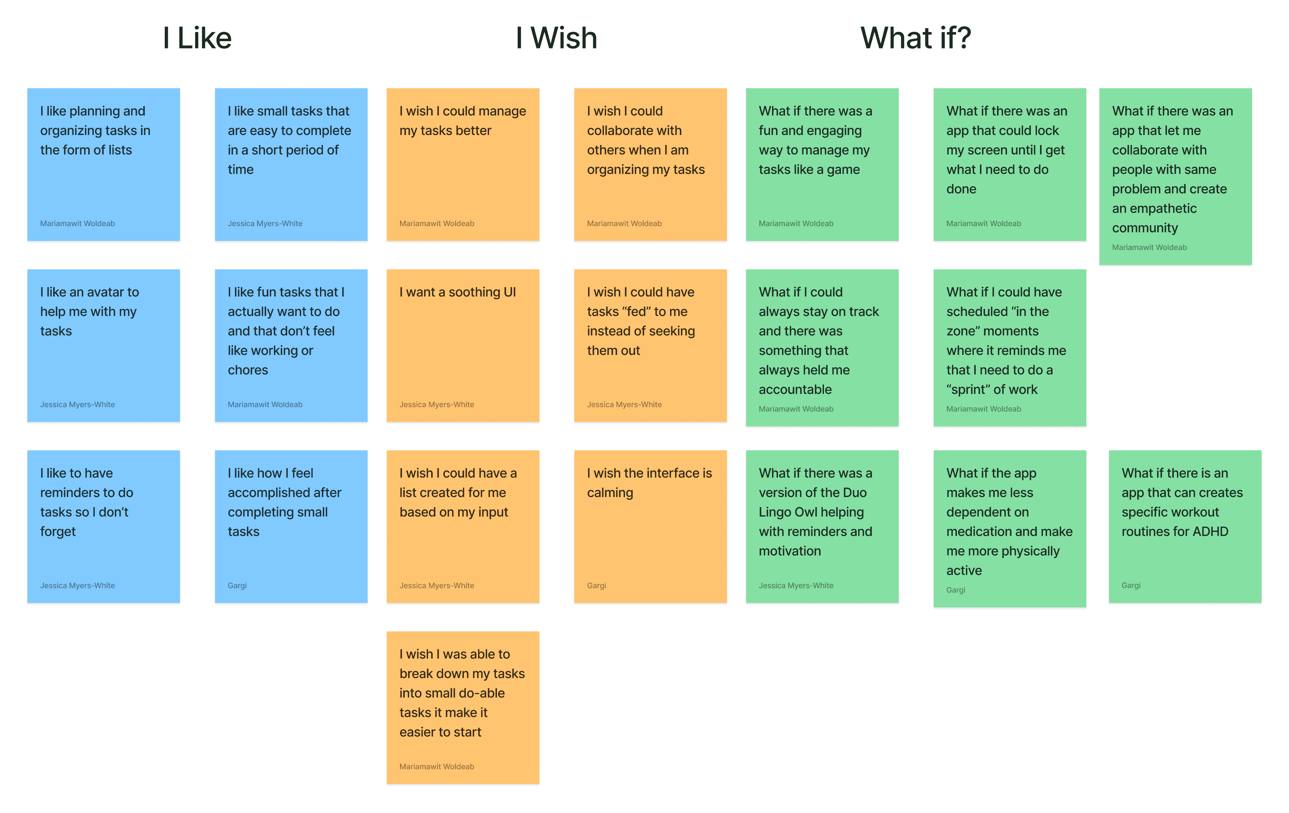
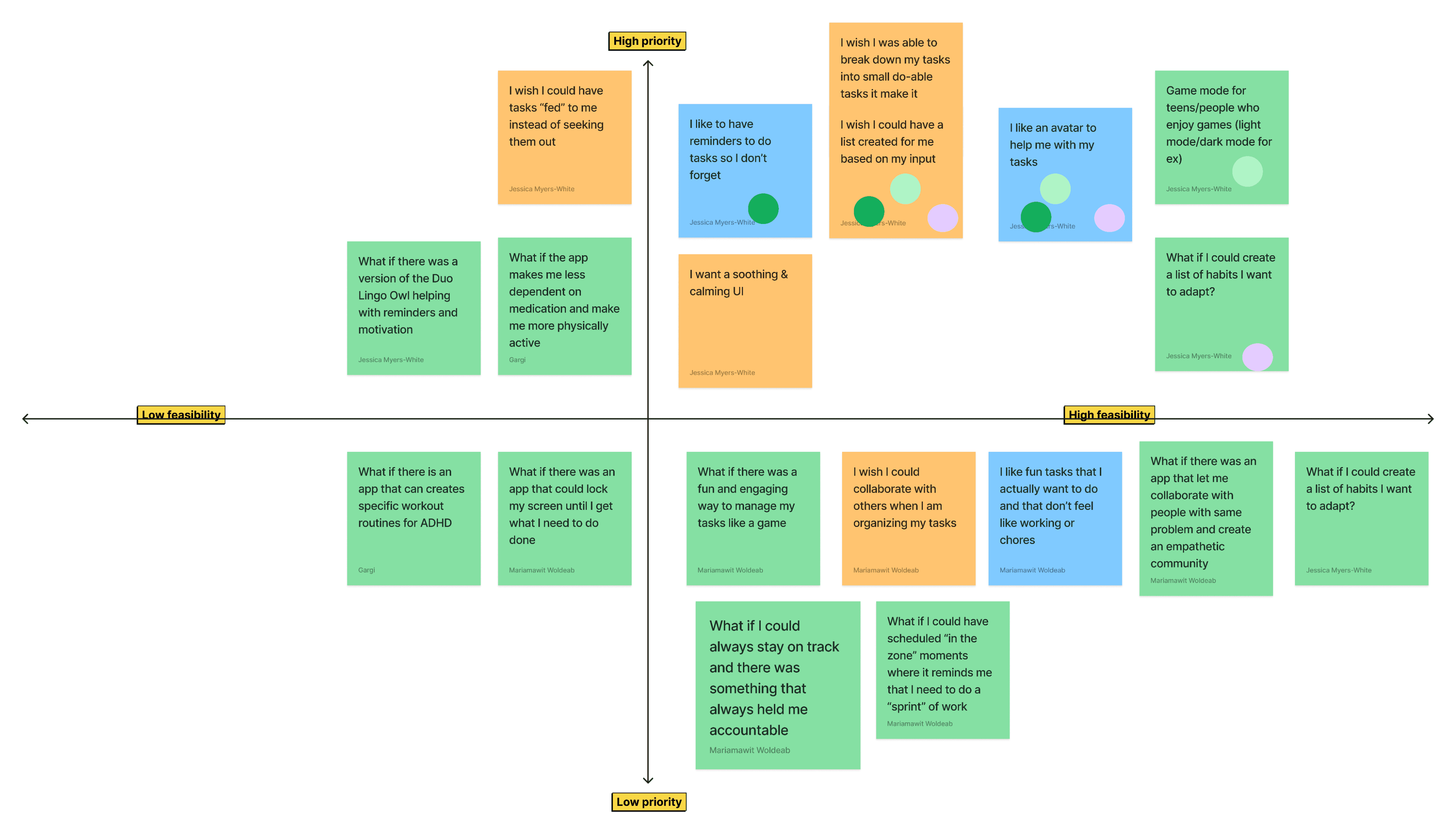
We Concluded that
Would be most important and valuable to our users given the research and
insights we gained from our feedback.
Breaking down tasks and priorities into lists
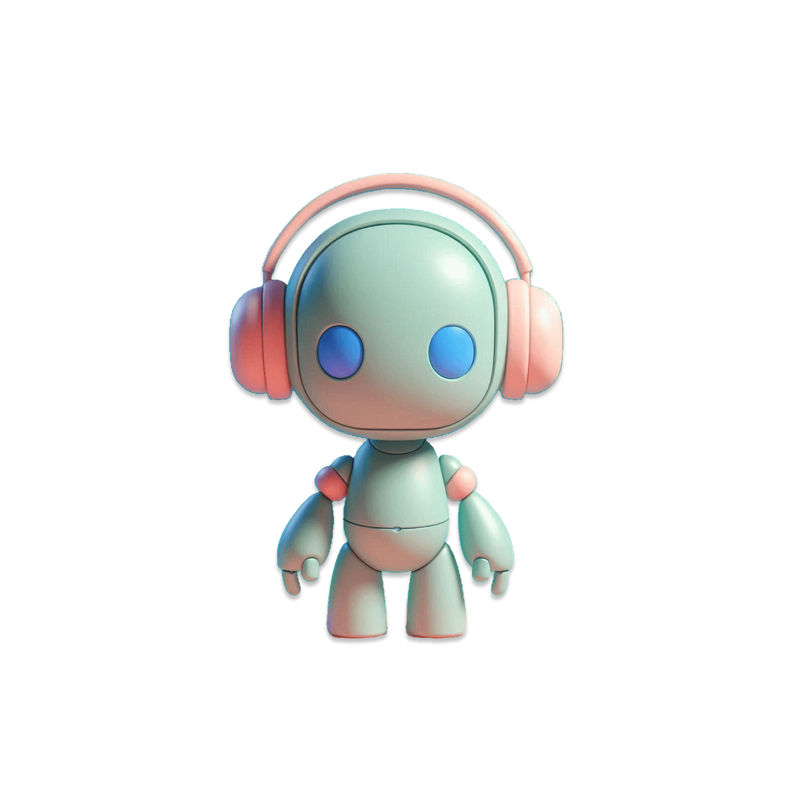
Having a helper avatar to help navigate the app to make usable and more fun
Having a tool to help set reminders to tasks and activities
Journey Map
Using our initial feature ideation we created our user's Journey map…
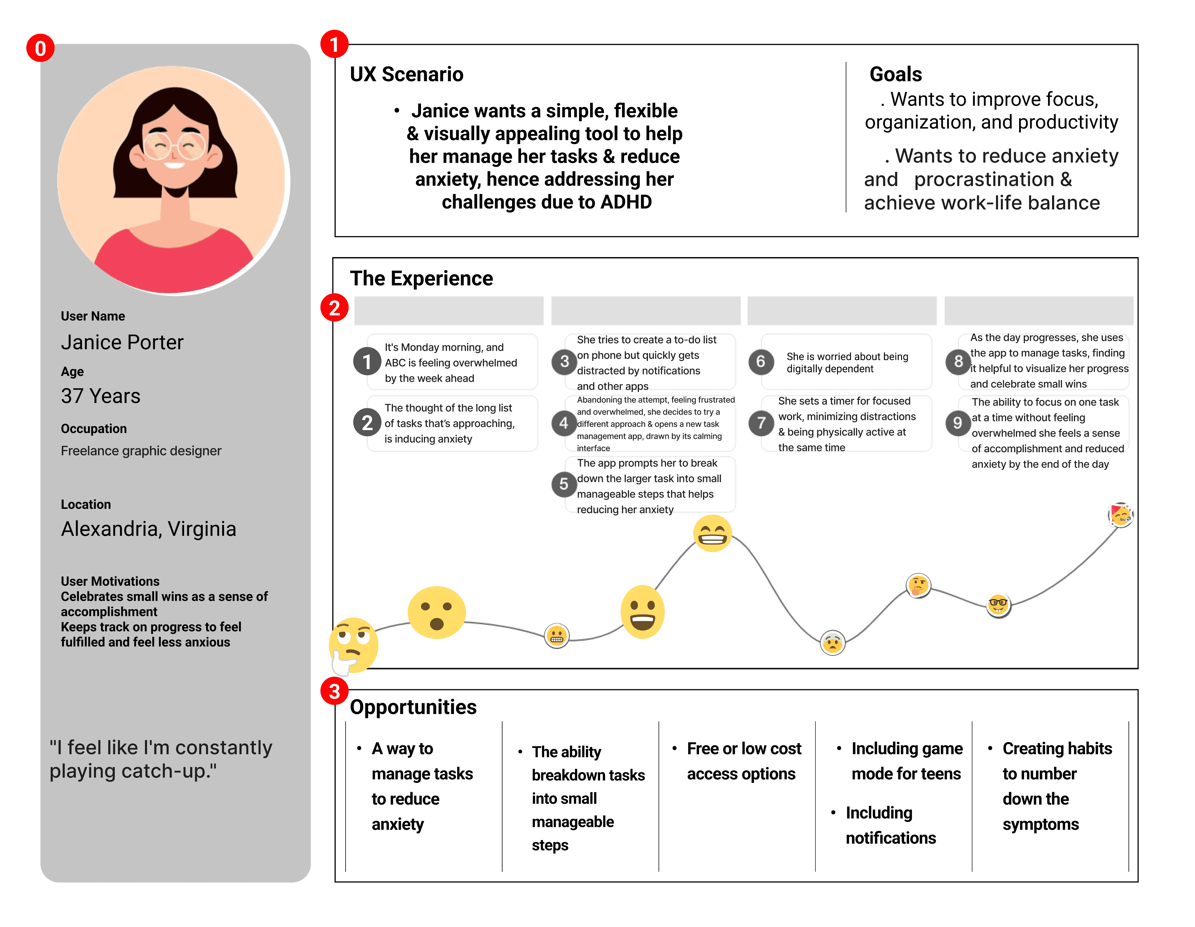
Janice represents a typical individual struggling with ADHD who seeks a solution to improve her task management.
Her desire for a simple, flexible, and visually appealing tool highlights the specific needs of this target audience.
Understanding her frustrations and goals will help guide the development of a task management solution that
effectively addresses their challenges.
Story Board
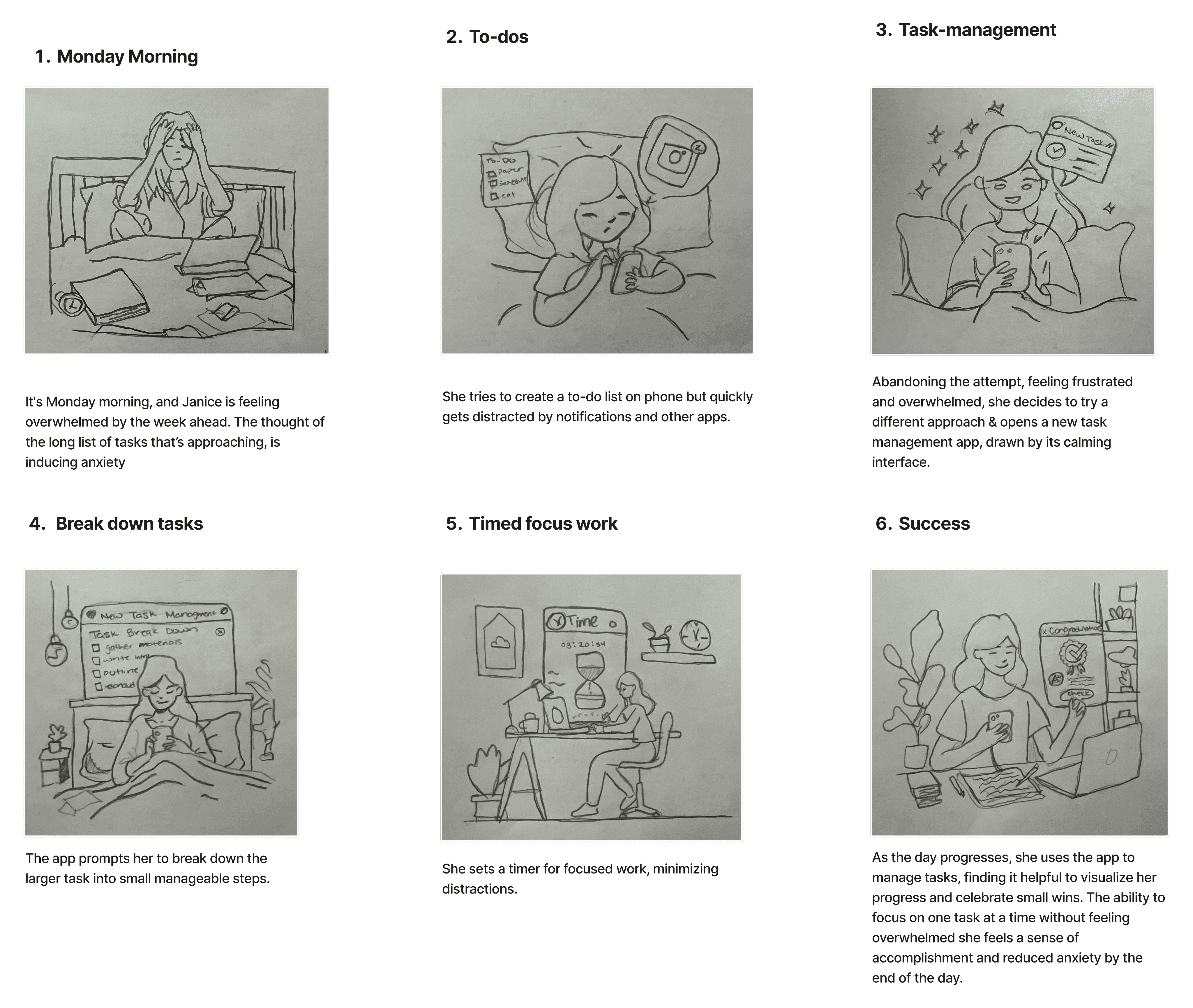
Using our user's Journey map we wanted to visualize their story…
User Flow
Creating a happy path for our user…
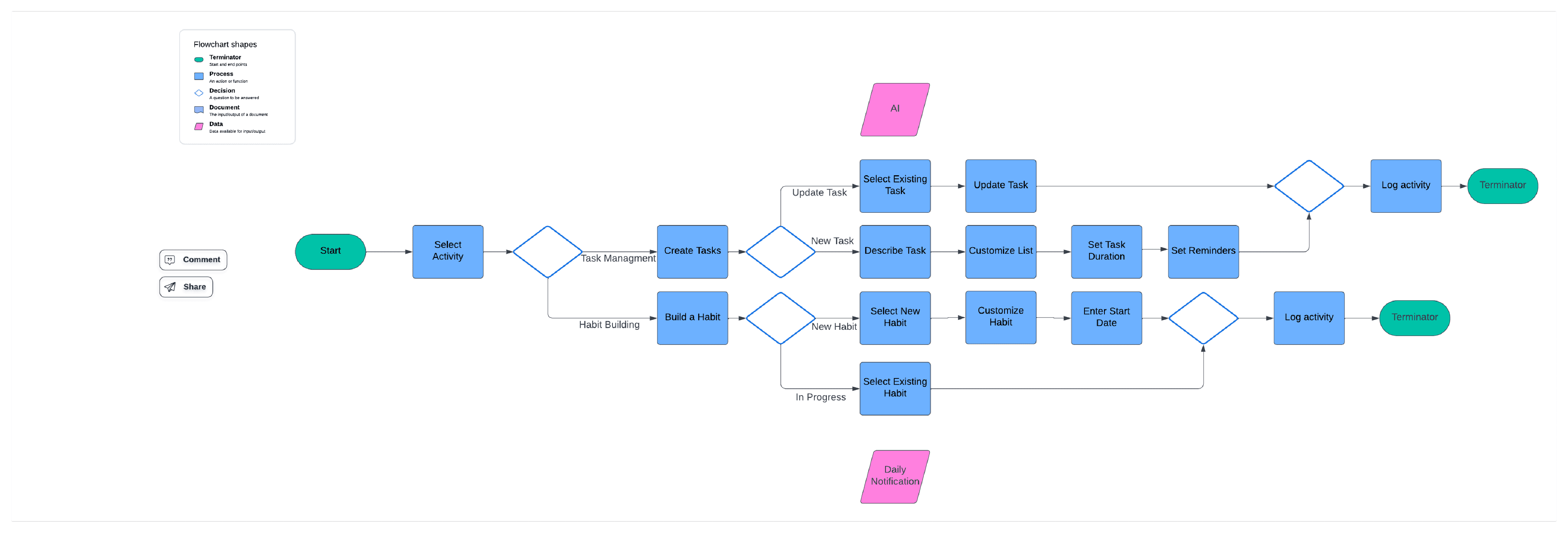
Synthesizing the user's scenario and visualizing their story allowed us to define a happy path. The resulting
user flow clarified product navigation, validated design principles, and provided a clear design objective.
navigation principles, and provide us with a clear objective for our design.
Our user's Task
Get past splash screen and select mood
Select view tasks
Select create new task
Fill in list name and give a description
Select generate
Customize generated list and set duration and reminders
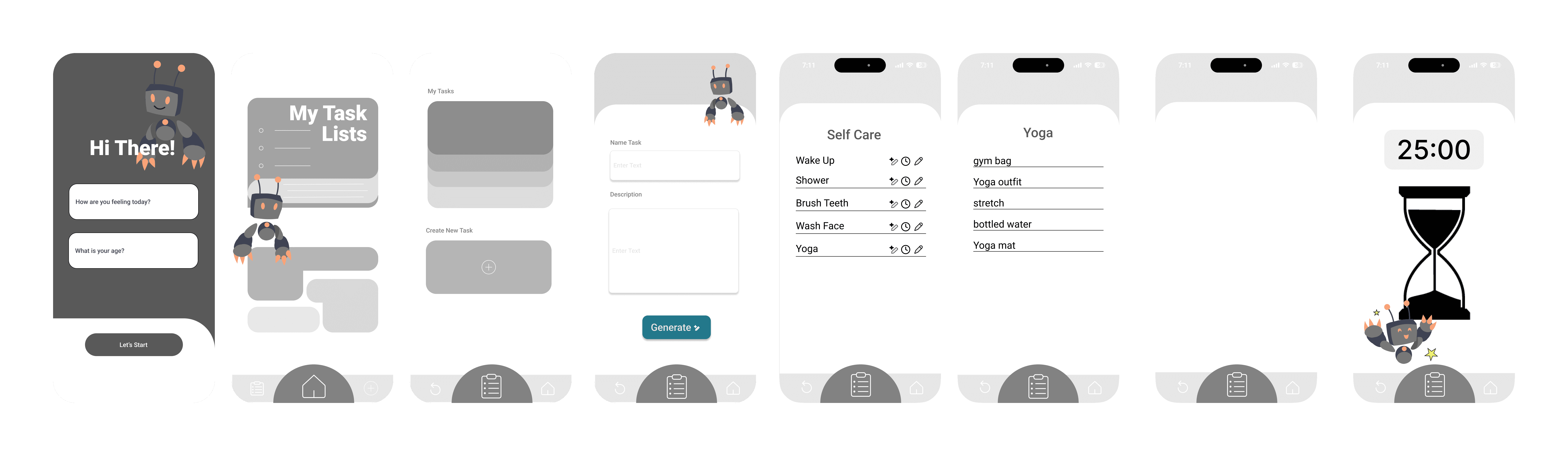
Wireframing & Testing
Paper Prototype


I facilitated a design sprint in which all three of us would come up with our own drawings for how we
conceptualized and visualized our app. We then came together and discussed which features from
each of our drawings would be included into our low-fi wireframes.
Low-fi Wireframes

We started our User testing using out low-fidelity prototype.
Our goal was to determine weather our design was user friendly,
easy to navigate, and weather it would actually help manage tasks
So we gave our users two tasks…
Our outcomes were good and users successfully completed their
tasks
Create a list
Set up a reminder to go to yoga class
Testing
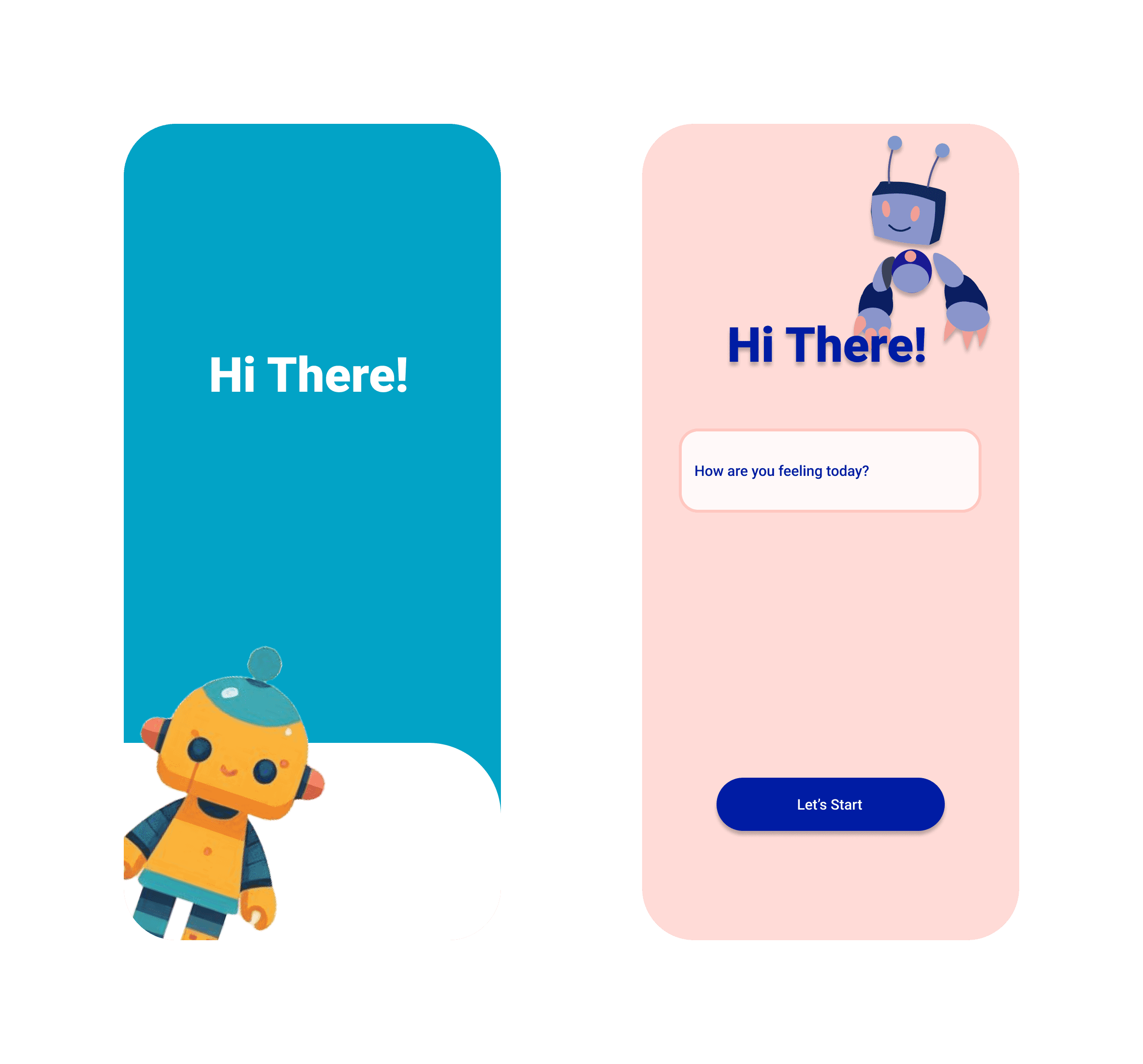
Mid-Fi Wireframes
Finally starting to see the app come together…

While testing our initial low-fi prototype one of our users gave us
valuable insignt on the avatar for the app. They wanted the
avatar to have a positive and uplifting look to it and even gave us
a mock up of what they meant which we
inlcuded into our mid-fi wireframes before conducting
our second round of usibility testing.
Usability testing
Making sure our designs are intuitive, easy to navigate, and appealing…
Through furter iterations and testing we concluded that our users appreciated the simple UI and the ease
of being able to navigate through the app. We were given feedback regarding the avatar that it might not
be suitable for an older audience since our objective is it make it usable regardless of age range. So we iterated
and kept asking for feedback until we came up with icons and imagery that would be suitable for all ages.
Before
After
Prototyping
Style Guide
Using all the feedback from usability testing we created a style tile…
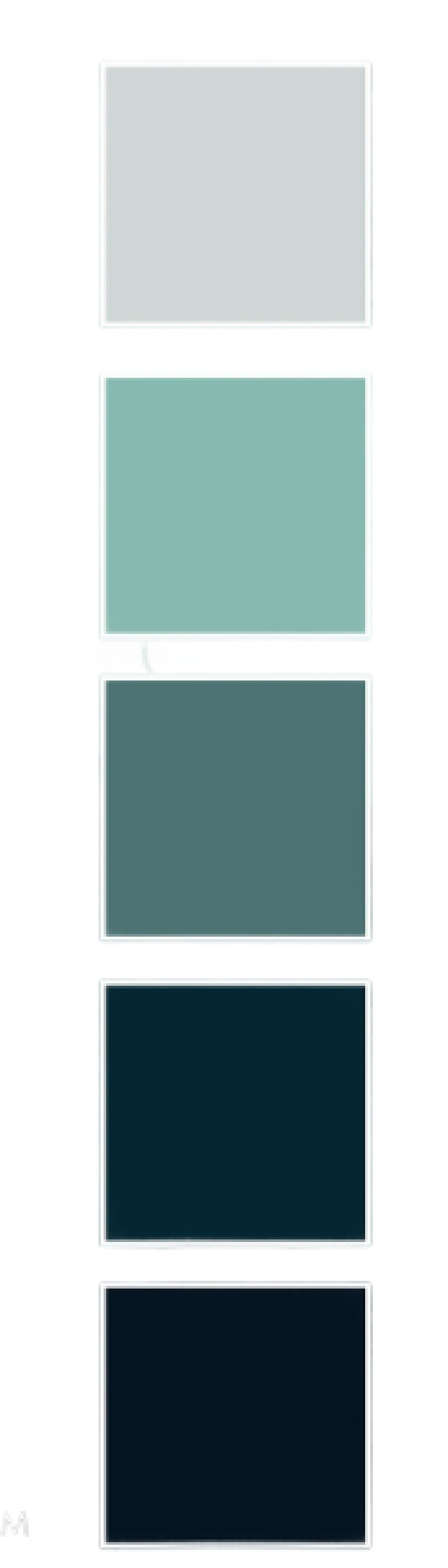
Given our earlier background research, we were able to determine that more soft, muted colors
were more suitable for users with ADHD. Colors like seafoam greens and muted shades of blue can
create a sense of relaxation and serenity. Greens promote relaxation while blues are sometimes
associated with focus.
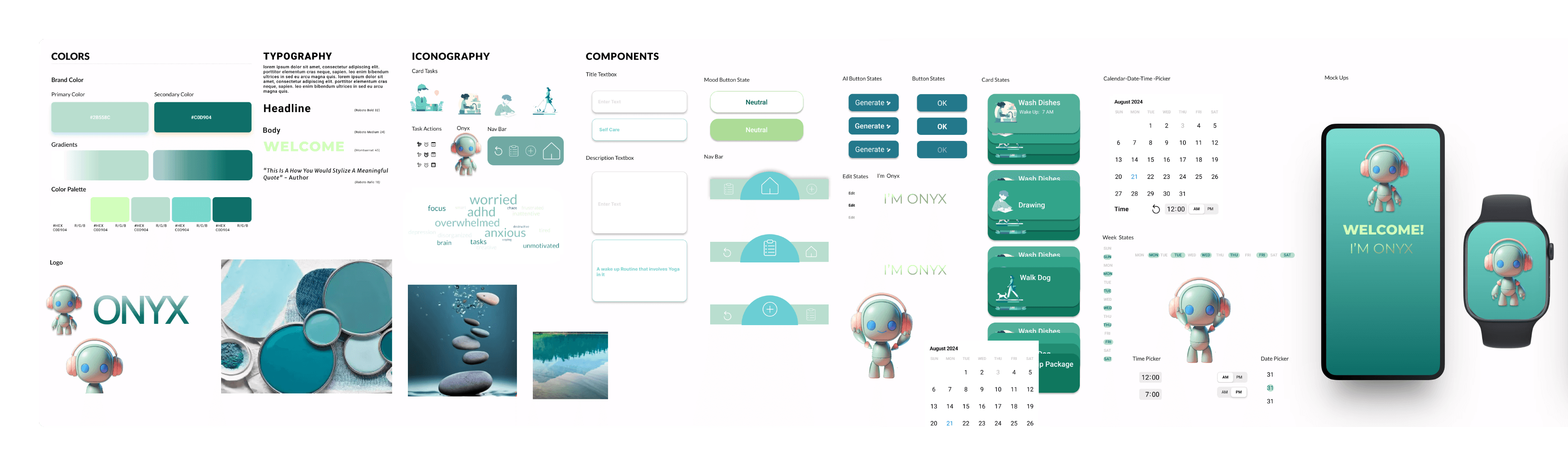
Final Mockups
Bringing it all together…
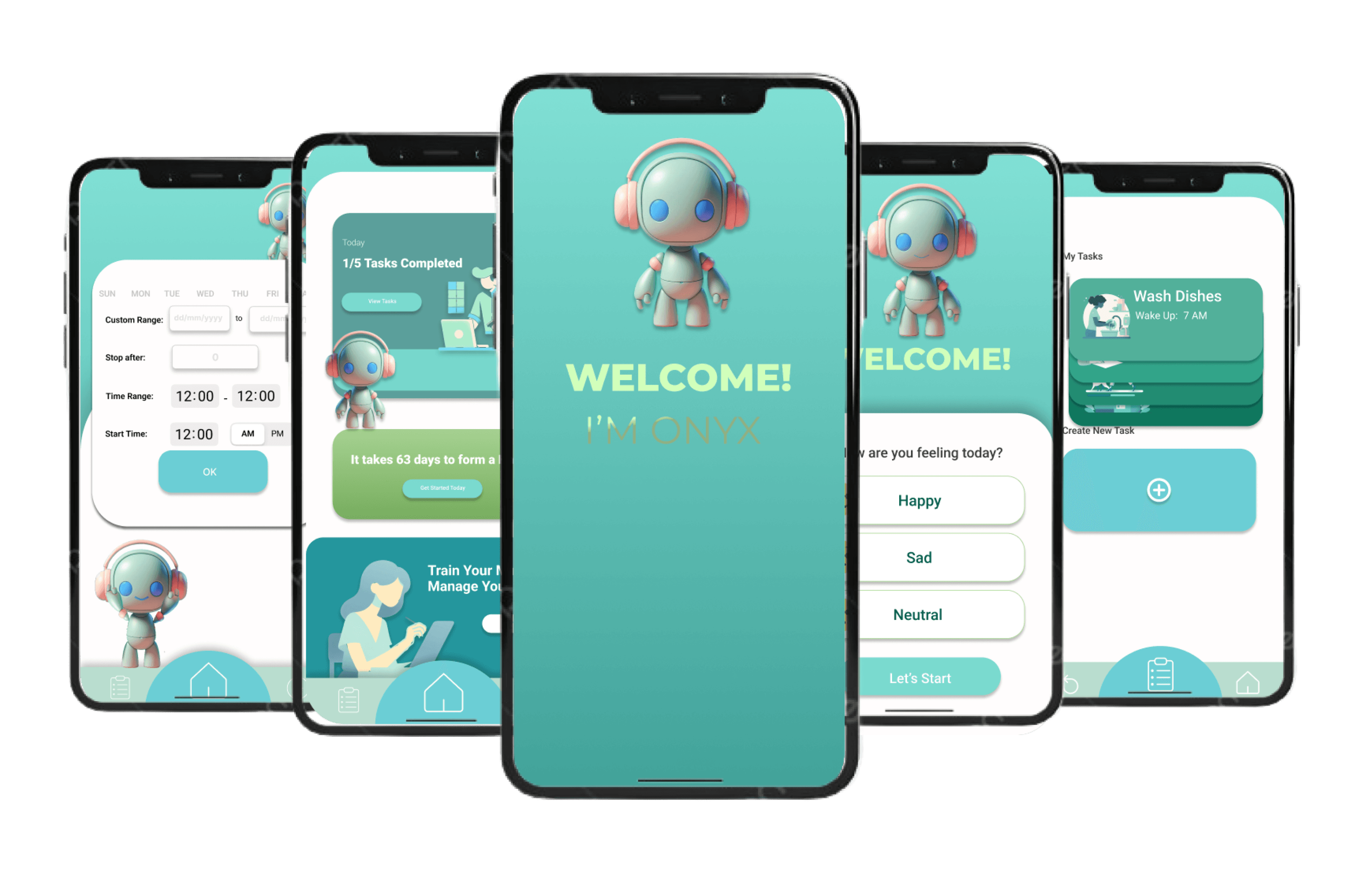
Clickable Prototype
Finally, we had a lot of ideas from our ideation and brainstorming phases that we didn't incorporate,
but could be future additions to this design…
Assigning tasks to the user based off of a large generated list of things to do
A feature that allows the user to visualize their progress
Feature that allows users to build community with other users on the app
Accessibility customization feature for users with visual or auditory impairments
Future Developments