" height="84px" id="MAQxlhQbJ" width="1263px"/></svg>)

" width="1026.5px"/></svg>)
Chess Girls DC
Chess Girls DC is a mobile app and website redesign for a non-profit organization that teaches young girls how to play chess
My Role
End-to-End UI/
UX designer
Team
Jessica Myers
Me
Industry
Education
Duration
2 months
Tools
Figma, FigJam,
Zoom
Existing Website

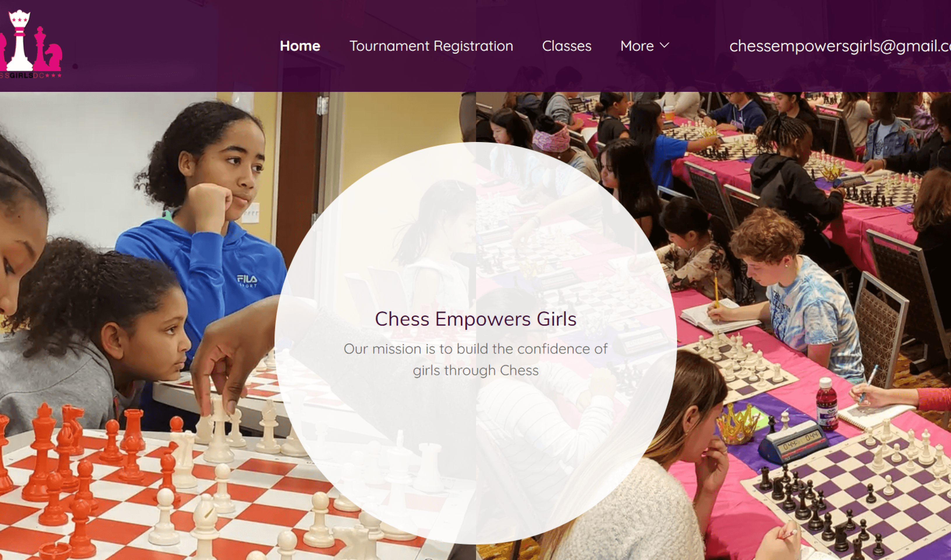
Chess Girls DC Existing Website
Our Process
Background
& Research
Heuristics Evaluation
Proto-persona
Accessibility testing
User interviews
Information
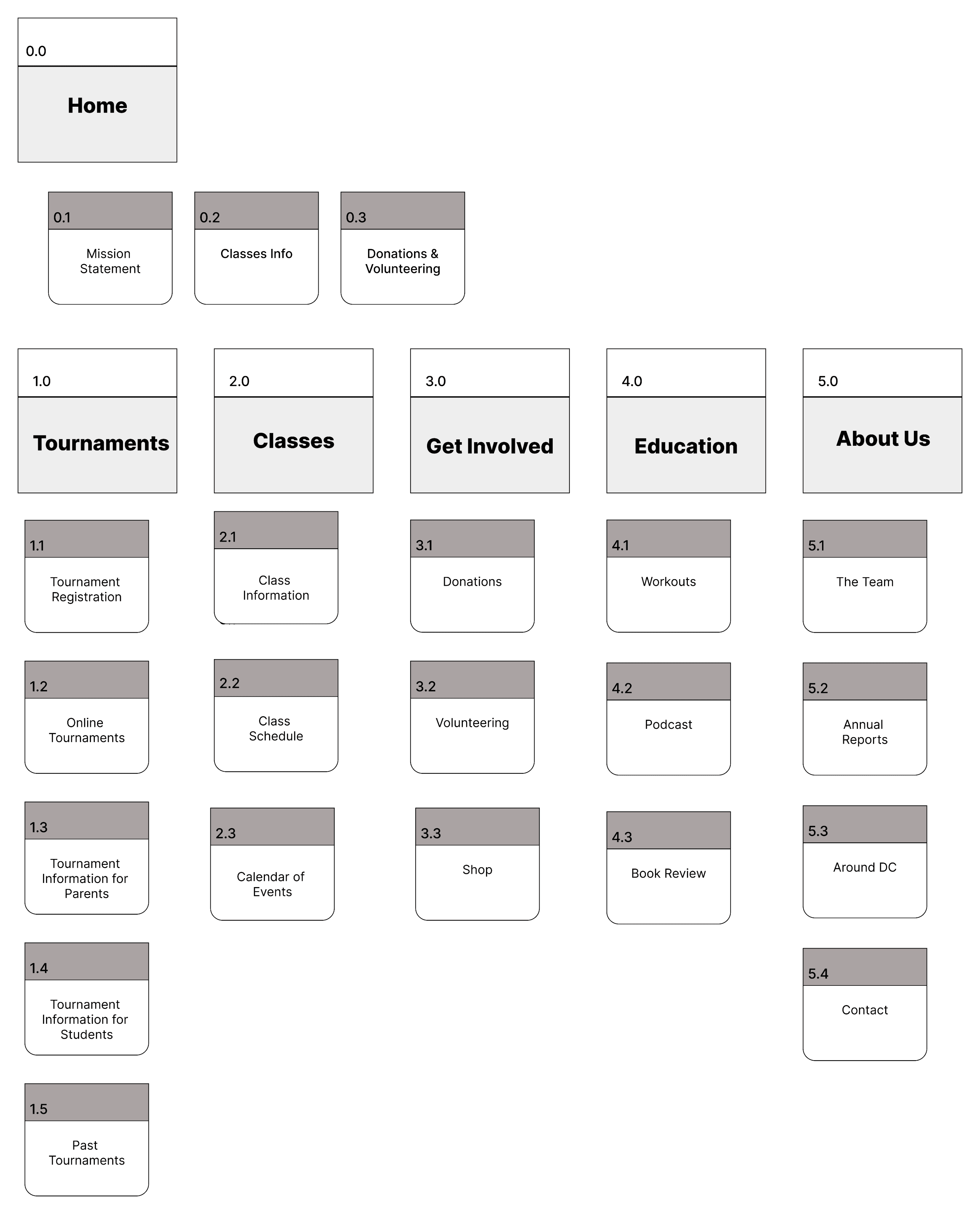
Architecture
Site Map
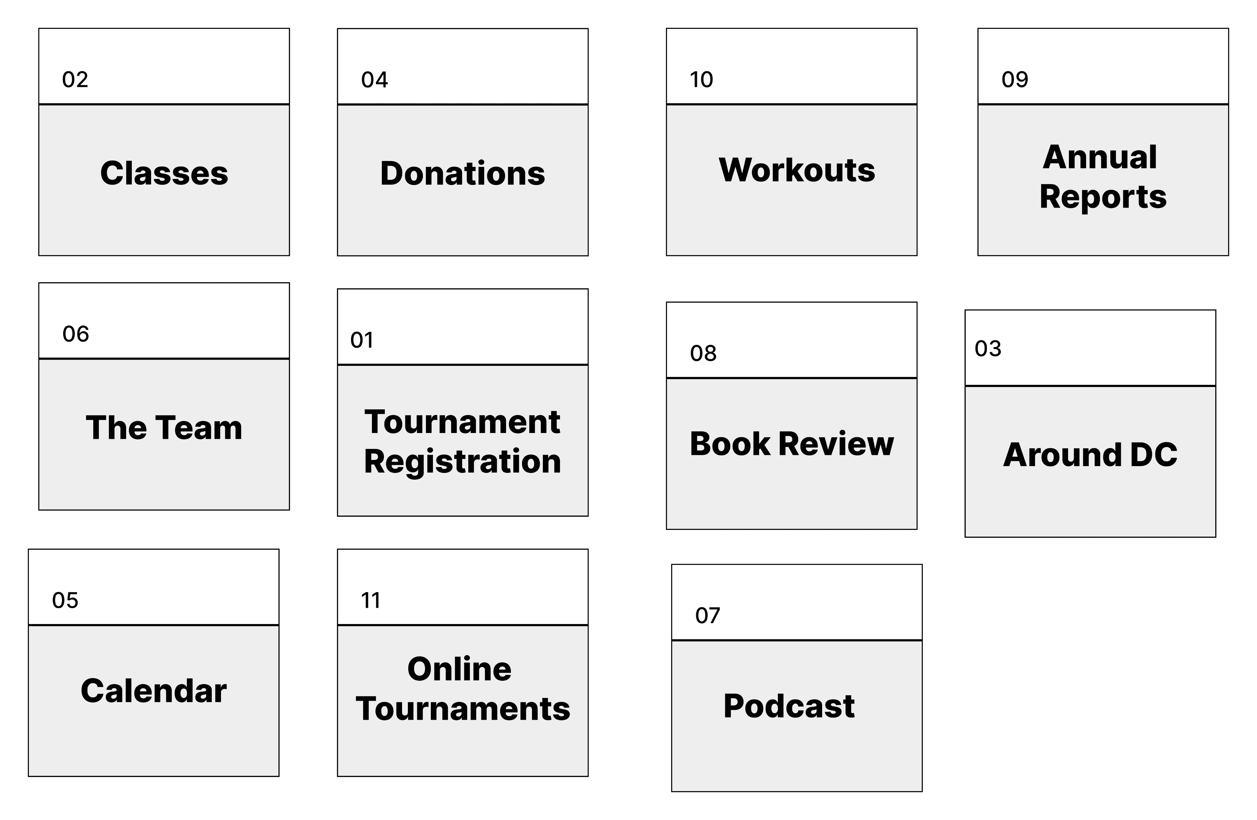
Card Sorting
Affinity Map
Competative
Analysis
Chess Girls DC
Chess Girls DC
Wireframing & Testing
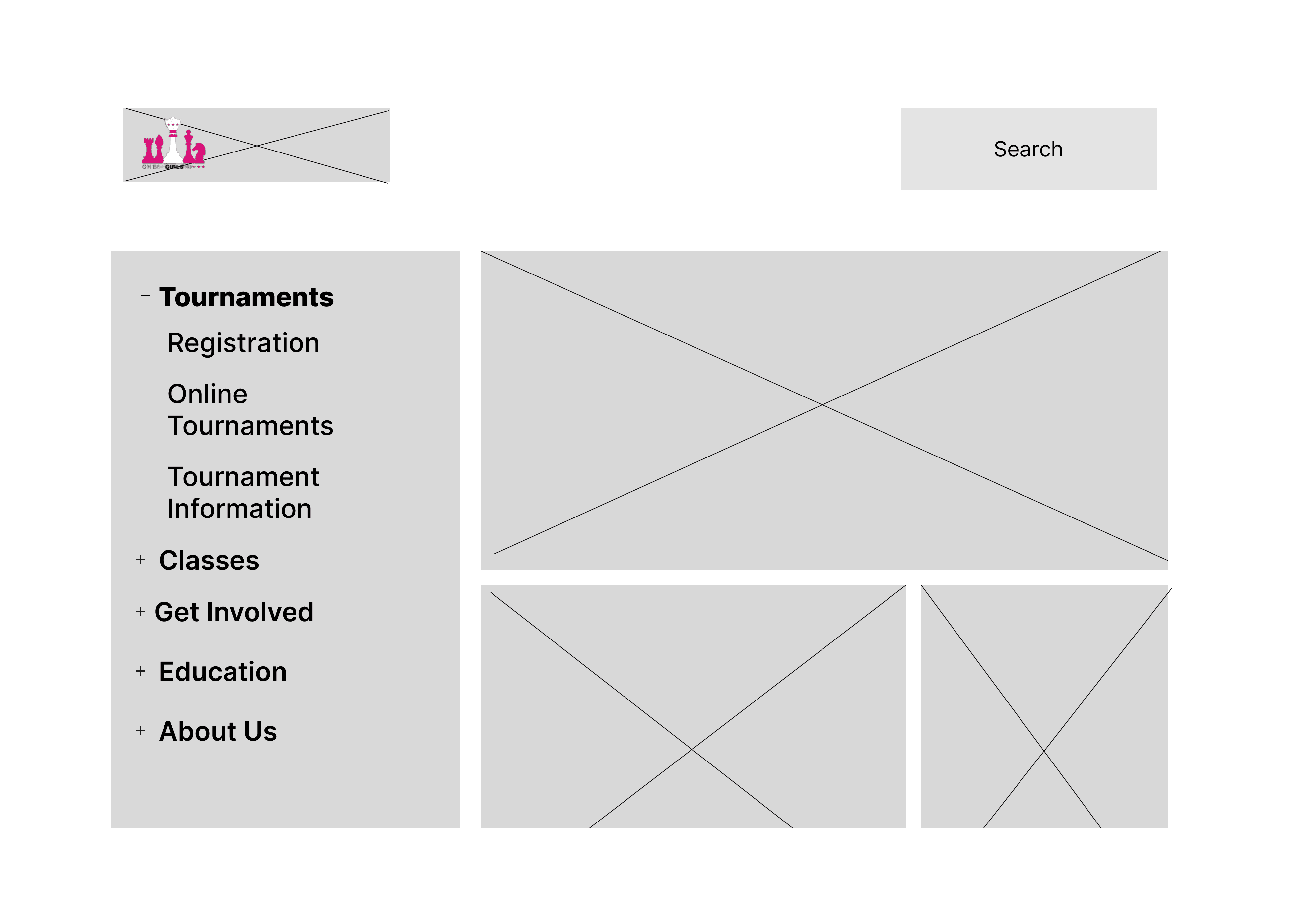
Low-Fi wireframing
Style Tile
Usability testing
Paper prototype
Prototyping
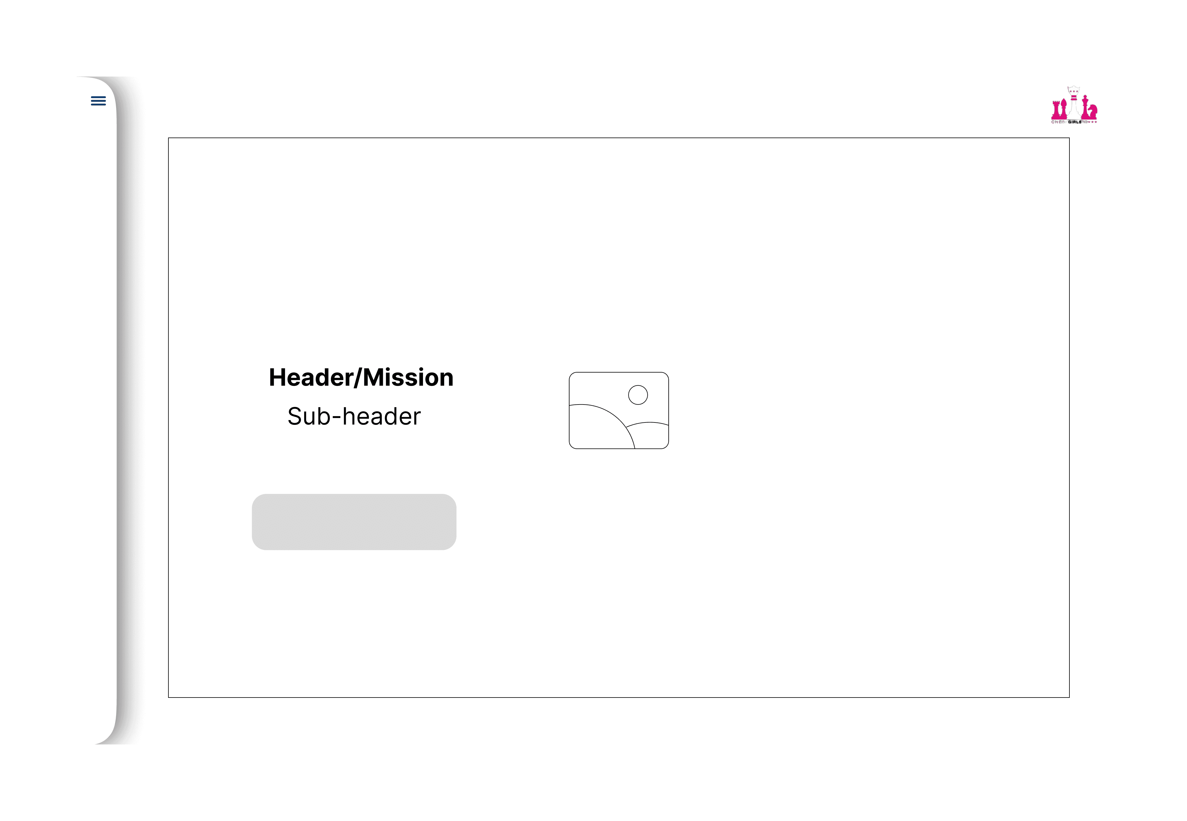
Mid-fi wireframes
Usability testing #2
Hi-Fi Prototype iteration
Preliminary Research & Background
Evaluating the existing platform and its user
Heuristics
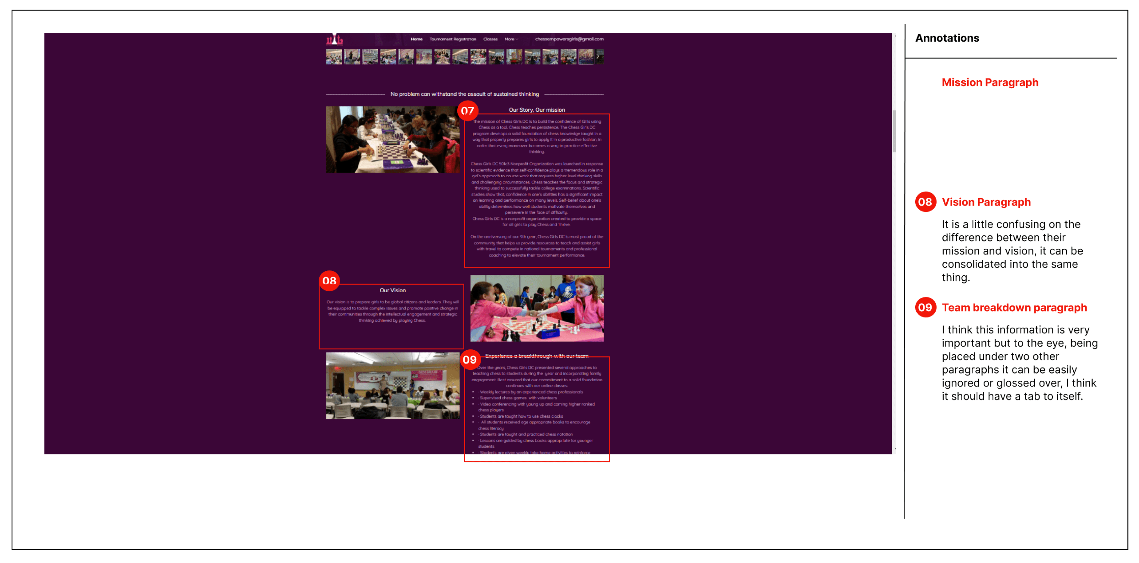
We conducted a heuristic analysis of the site to identify areas for improvement. The results showed three key areas of concern:
Purple on Purple background makes the site difficult to read and fails the accessibility test for color blindness
Navigation is difficult - the site does make efficient use of the navigation structure currently in place
Pictures, banners, quotes and other elements crowd the pages making it difficult to find things and focus on the information
Interviews
In addition to user feedback on readability and navigation, respondents also noticed
Respondents felt that privacy and liability waivers were hidden
Most respondents had concerns about the number of photographs of minors on the site, some very strongly objected to the pictures
Some respondents were put off by the email address being the only means of contact and were confused about the private lesson form
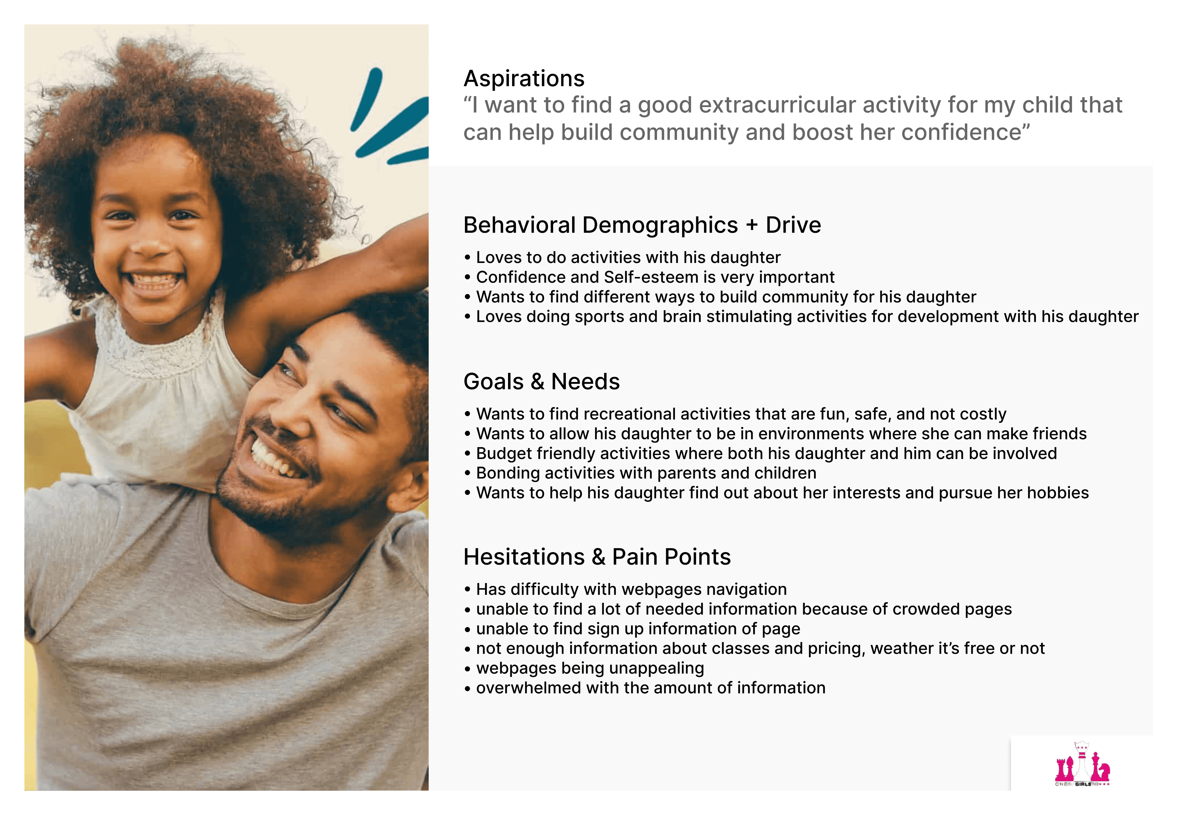
User persona
Our Solution
We selected three primary goals for the ChessGirlsDC redesign:
Facilitate the sign up process using clear instructions along with detailed information about the class
Improve accessibility and readability of the site for our target users and prioritize important information for the home page
Improve the look and feel to make the site more engaging and fun for kids
User Flow

Card sorting
Low-Fi Wireframing


Usability testing
Through our research we were able to develop a redesign that addressed existing pain points and also embraced fresh ideas to enhance the user experience.
We prioritized gathering feedback from our users, valuing their insights into what worked and what didn’t
Our strategy was rooted in attentive listening
Additionally, we studied the approaches adopted by similar sites.
Our Style
We aimed to strike a balance where the site captivates young users while remaining effortlessly navigable for parents
A vibrant color palette exudes energy and excitement, ensuring an engaging visual experience for all visitors

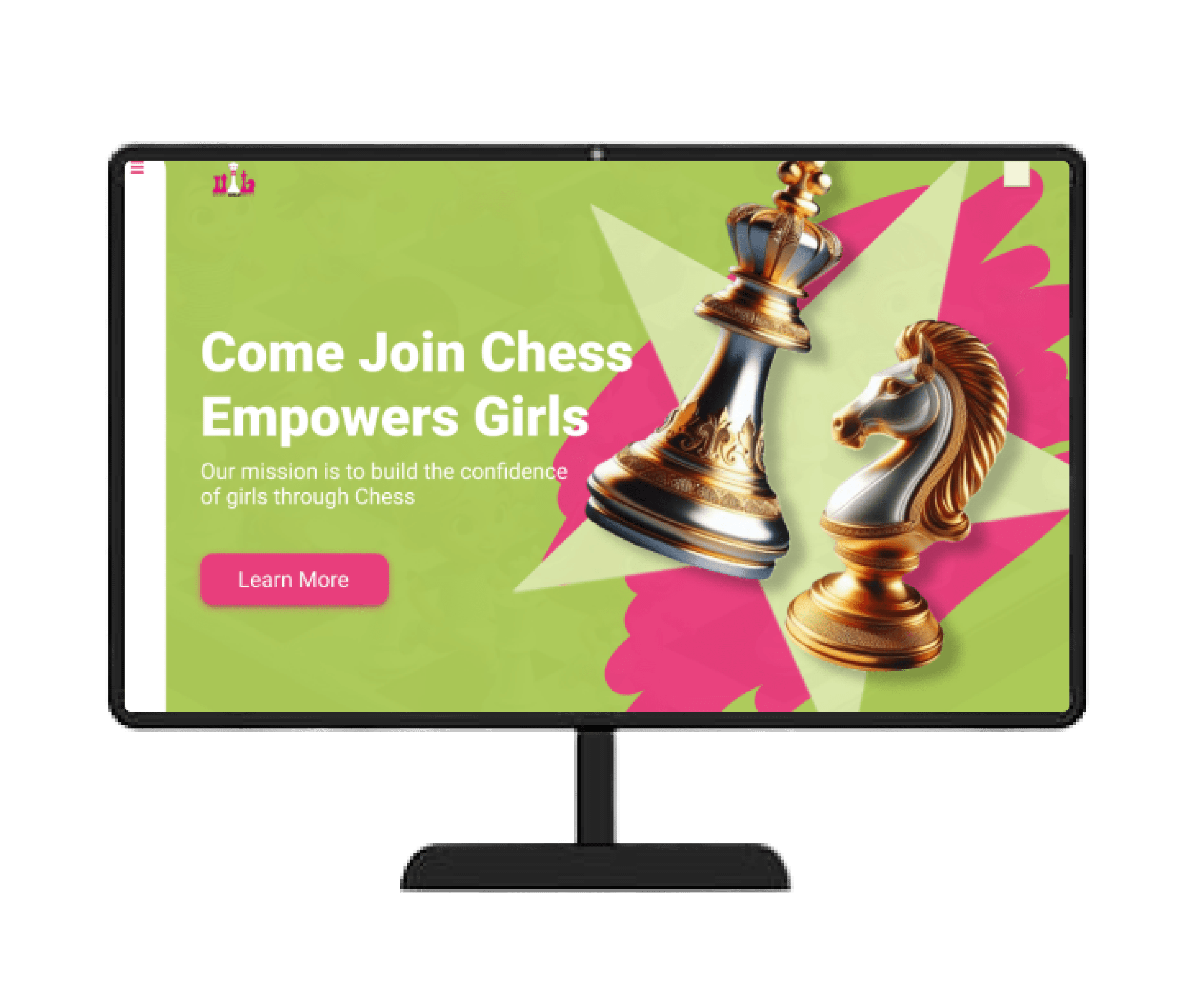
Hi-fi solution

Desktop

Mobile
iPad
Clickable Prototype
Conclusion and future
Our key takeaways:
Efficient navigation guides users to their desired content and helps focus their attention on significant aspects of the company's offerings
Thoughtful organization and prioritization of content significantly influence user engagement levels
Color palette emerges as a critical factor, as it not only sets the tone of the site but also captivates users' attention and enhances appeal to the target audience(s)


Take Me Back To The Top